A website is a collaborated collection of World Wide Web (WWW) files which starts off with a homepage. An organization or an individual provides the person with their homepage address through which the person can visit their website efficiently. With the help of the homepage address, one can visit all the pages available on their website.
A synonym or a less used word used for website is web presence. A responsive web design is an approach used for more optimal view experience, easy navigation and easy scrolling within a huge range of devices like cell phones, laptops etc. In the past it was necessary to have a special designed mobile version of a website for your cell phone. However, now with the new advanced responsive websites, it is easy to maintain one site that fulfills all of your needs. Responsive websites have the ability to change their layouts and appearances according to the size of the availability of screen.
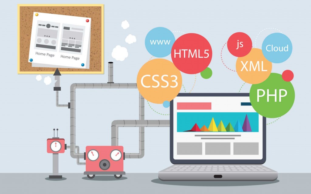
Responsive websites also have the ability to make the buttons on the screen easier to use. The pied pipers of any responsive website are the web designers, who use an array of tools according to the need to compose an ideal website. It is important for a web designer to consider what part of the production is important and the set of instructions required to create the perfect web design are compatible or not. The means of building sites keep becoming more and more efficient day by day, however, the basic software principles remains the same. It is entirely up to web designers that how they use the old techniques to make it more accessible and more time accomplished for building responsive websites. The web formatted imagery and design prototypes are made by graphic designers by using vectors and raster graphic packages. There is a standard markup set allotted for creation of a responsive website. Standards or software used for the formulation of a responsive website are HTML (HTML5), CSS (CSS3) and JAVA. There is a list of applications also available to make the entire experience more efficacious and user friendly, which include grid and frameworks, sketch sheets and wireframes, javascript and query plugins, testing and preview, sliders, columns, isotopes, etc. Different methods are used for designing a website, keeping in mind the factors like the pixels of most of the devices vary, the size of screen of a smartphone is different from that of a tablet and so on, and hence different tools help the web designers to create the websites according to the need of the client.
Therefore it is important to consider both landscape and a portrait mode, as it serves graphic designers an idea that how the website will appear and how much time it will take to reload or load additional scripts every time a person auto rotates its device. So responsive websites help the users to utilize and surf the website without having trouble regarding the screen and pixel size. The backbone of any website is its design. If it is designed efficiently by correct means it will work wonderfully for an individual.
For more details, please visit: KEYIDEAS Or call: +1 (617) 934-6763
Source:http://goarticles.com/article/Backbone-of-an-Ideal-Responsive-Website/8943160/
 RSS Feed